The Problem
Many realtors struggle to appear when buyers search for help online.
Meanwhile, buyers lack tools that clearly explain affordability, assistance programs, and location risks.
This gap creates missed opportunities for both sides.
Product Concept
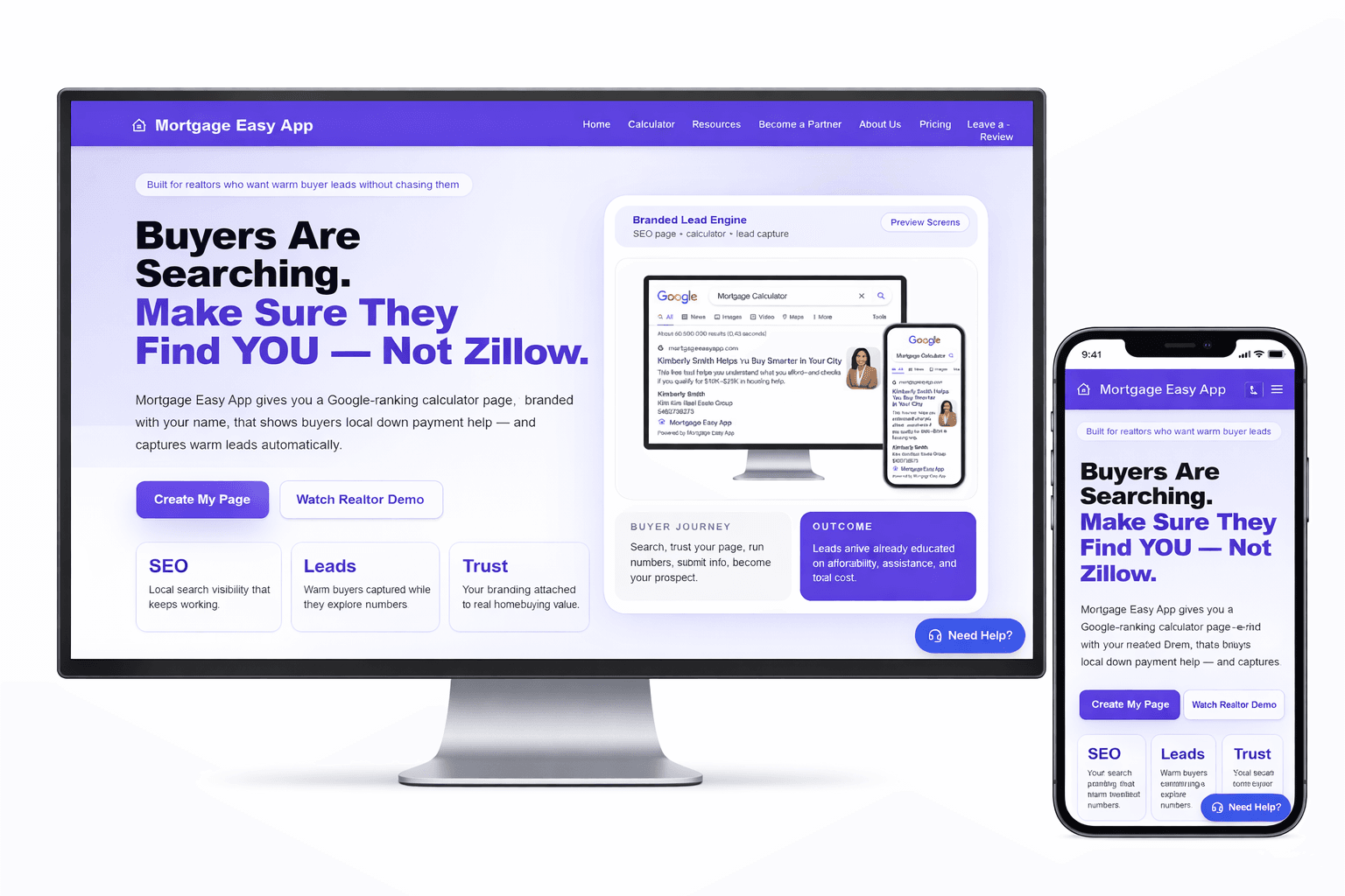
Mortgage Easy connects homebuyers and realtors through a value-first experience.
Instead of forcing contact forms, the platform provides financial insights first, which naturally converts into qualified leads.
Platform Entry Paths
The product allows both realtor discovery through search and independent affordability exploration. This increases reach while maintaining lead generation.
Path 1
Realtor Discovery
Path 2
Direct Tool Usage
Key Features
Feature 1
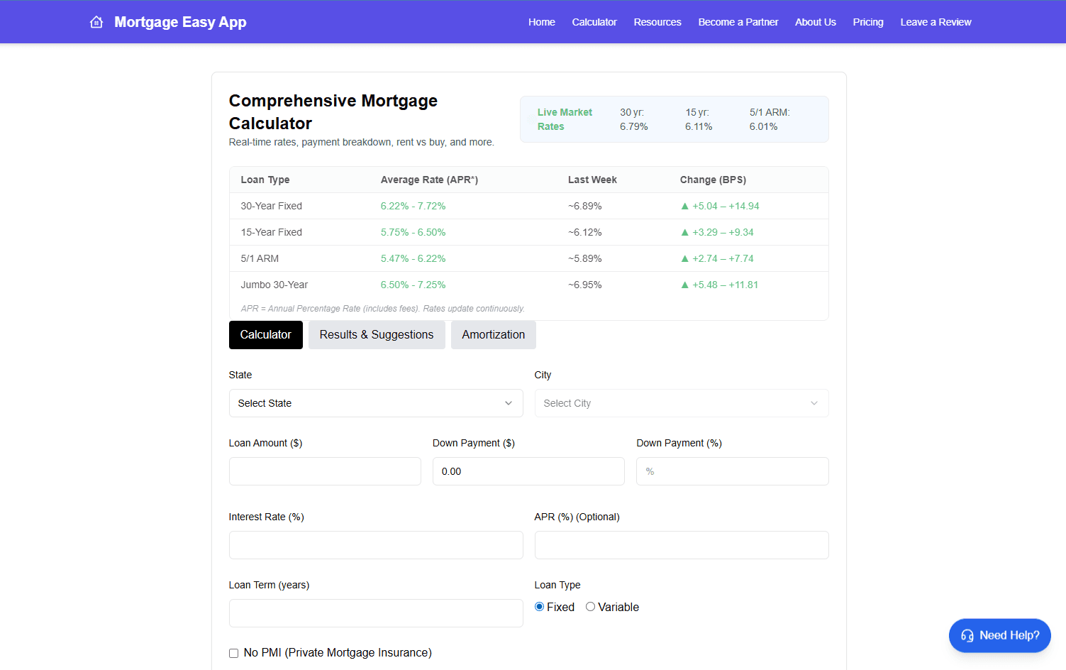
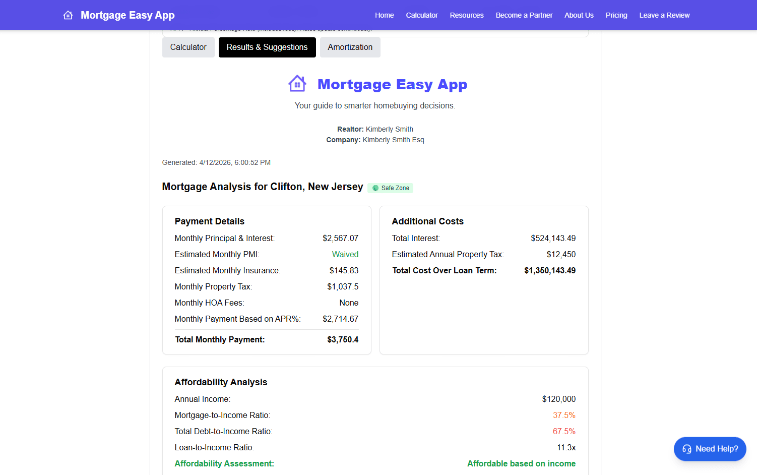
Affordability Intelligence
The calculator estimates the real monthly cost of owning a home by including taxes, insurance, and affordability analysis.
Feature 2
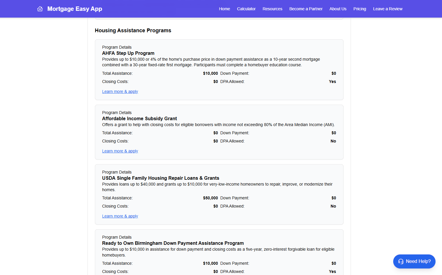
Location-Based Assistance Discovery
Using city and state data, the platform identifies relevant first-time homebuyer assistance programs available to the user.
Feature 3
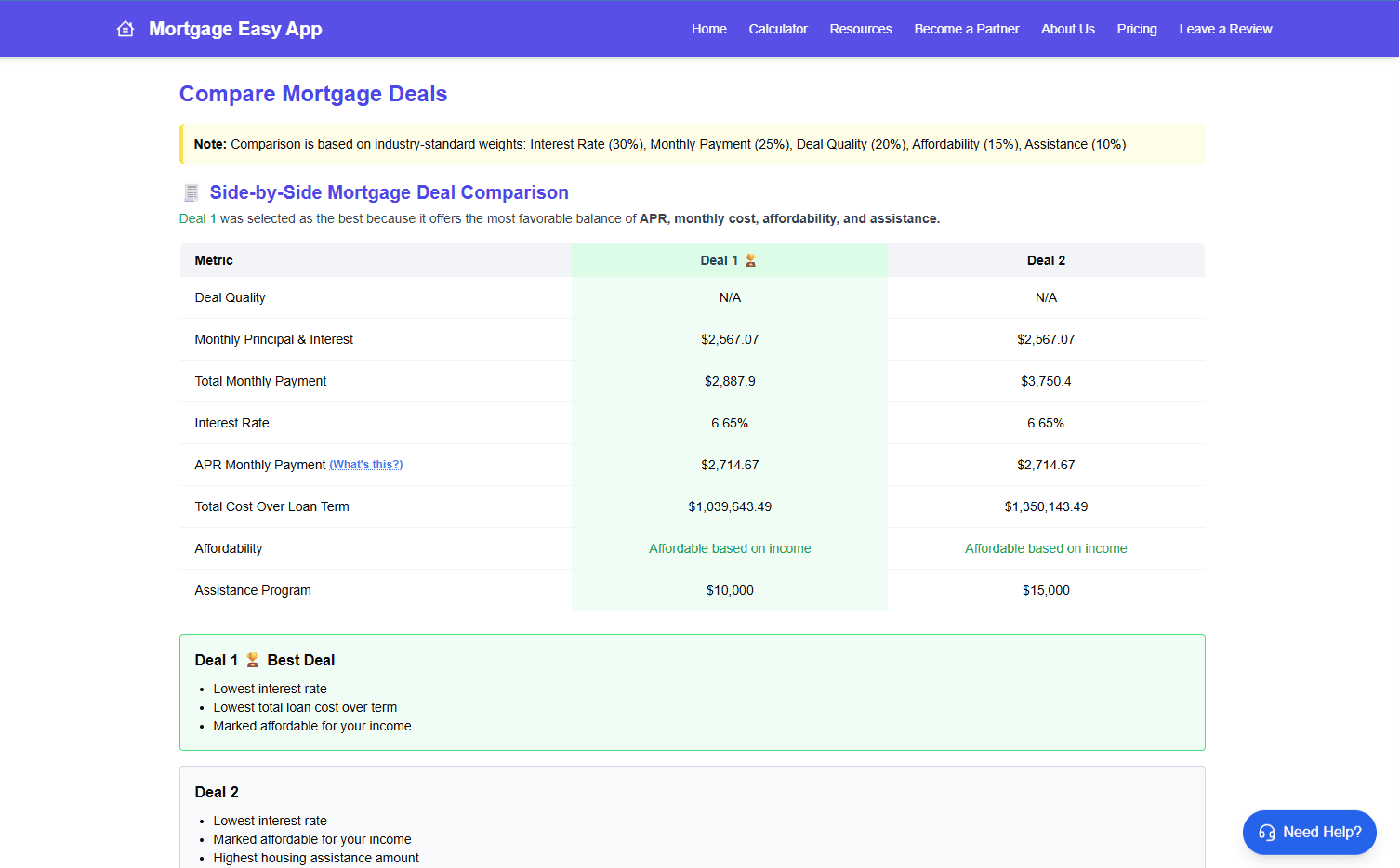
Deal Comparison Engine
Mortgage Easy evaluates mortgage scenarios using metrics such as deal quality, affordability, and total loan cost to highlight the most favorable option.
Feature 4
City Safety Insights
Cities are categorized into Safe Zone, Moderate Risk, or High Risk, giving buyers additional context when evaluating potential locations.
Design Decisions
Trust-first lead generation
Instead of pushing users to contact a realtor immediately, the platform delivers valuable insights first.
Lead capture happens after buyers understand affordability, assistance, and tradeoffs, which improves intent quality for realtor partners.
Product Roadmap
Flood Zone Awareness
Help buyers avoid environmental risks
School Quality Insights
Help families evaluate neighborhoods
City Expansion
Increase geographic coverage
Assistance Program Updates
Maintain accurate financial resources
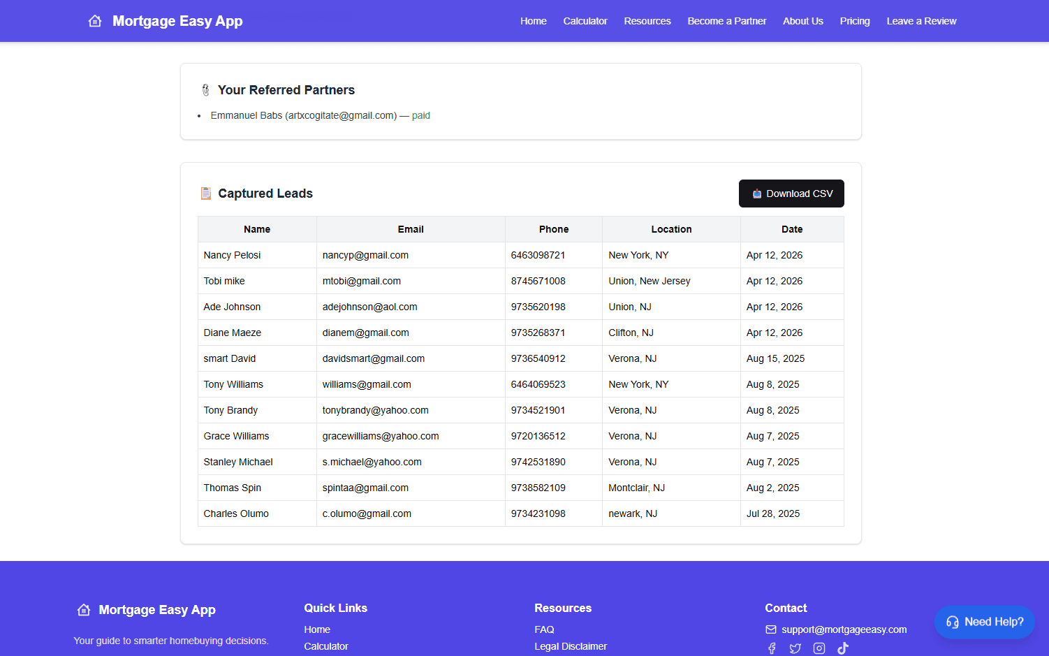
Realtor Dashboard
Allow partners to track and download leads
Reflection
Mortgage Easy reinforced the importance of aligning user value with business value.
By helping buyers make better decisions first, the platform naturally creates high-quality leads for realtors.