The Opportunity
The core problem was not lack of relationship content. It was lack of structure.
People often leave relationships with strong emotion but weak understanding, then carry the same patterns into the next relationship.
People leave relationships with confusion instead of clarity.
Existing advice is fragmented across blogs, friends, and social content.
Most products offer opinions, not structured reflection.
Without pattern awareness, users repeat the same behaviors in future relationships.
Product Vision
I designed WhyFailedRelationship as a reflection and learning platform, not a generic advice product.
The goal was to help users analyze communication patterns, trust issues, emotional behavior, boundaries, and personal growth without turning the product into a blame engine.
At a broader level, the product aims to strengthen emotional awareness so users can bring more maturity into future relationships.
Solution Design
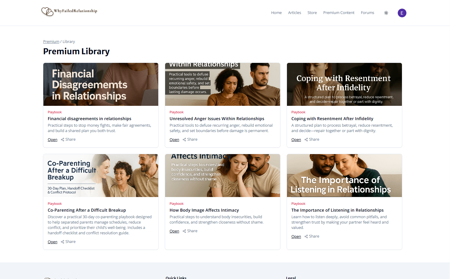
Educational Knowledge Base
A content system organized around the five themes where relationship issues most often surface: trust, communication, breakups, financial, and self love.
Structured Reflection
Prompt-driven flows that turn emotional memories into clearer behavioral insight around communication, boundaries, trust, and unmet needs.
Community Learning
A discussion space where people can share experiences, ask questions, and learn from similar situations without the tone of social media.
UX Process
The product direction shifted from content-heavy education to guided self-reflection once the research showed users needed help applying insight, not just consuming it.
Step 1
Problem Framing
Defined the core gap as a reflection problem, not a content problem: people could find information, but they lacked a system to apply it to their own experience.
Step 2
Research and Pattern Discovery
Mapped recurring breakdown themes across relationship content and found consistent signals around communication, trust, emotional incompatibility, financial stress, and self-awareness.
Step 3
Information Architecture
Reduced the platform into five core categories so users could enter from their specific situation instead of browsing vague advice.
Step 4
Interaction Design
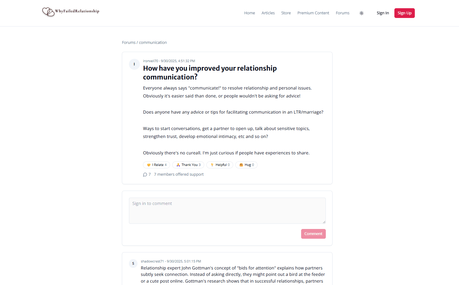
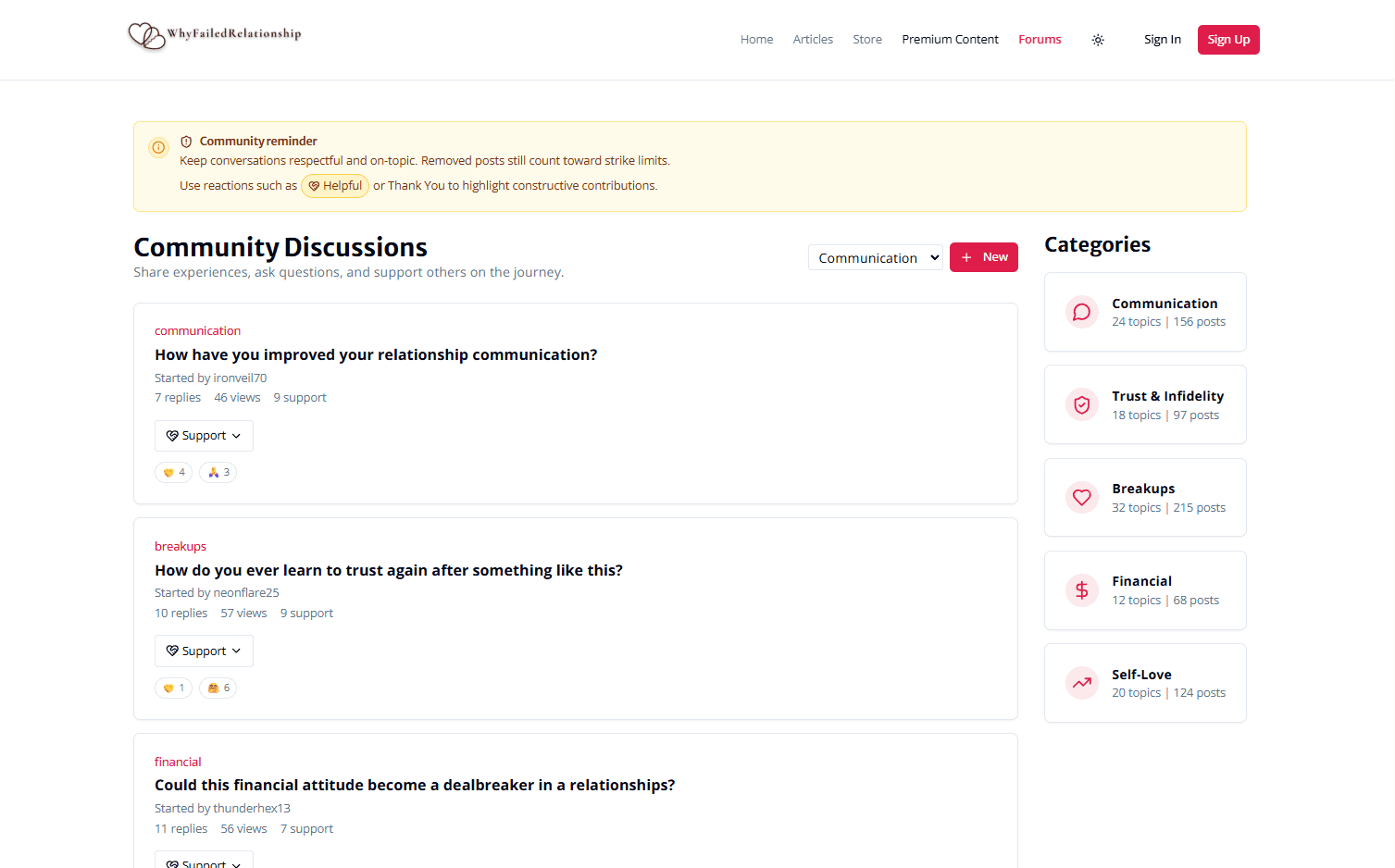
Reworked forum behavior for emotional safety by replacing generic reactions with supportive responses such as I relate, Hug, Thank you, and Helpful.
Step 5
Prototype and Iteration
Used AI-assisted prototyping to test article navigation, prompt engagement, and forum participation, then simplified layouts and language to keep the experience calm and guided.
Design Decisions
Emotional Safety
Avoided attention-hacking patterns, aggressive notifications, and gamified reactions that would make vulnerable sharing feel performative.
Guided Thinking
Structured content and prompts to move users from emotional reaction toward clearer understanding step by step.
Calm Interface Design
Used readable typography, strong hierarchy, and low-noise layouts so the product feels reflective rather than stimulating.
Empathetic Interaction System
Standard social reactions like like, love, and upvote felt tonally wrong for vulnerable breakup stories. I replaced them with interaction language that supports emotional context.
Screen Breakdown
Screen 1
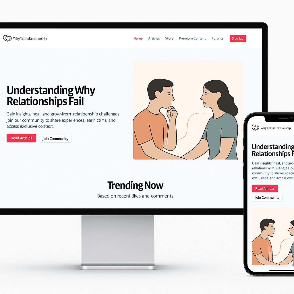
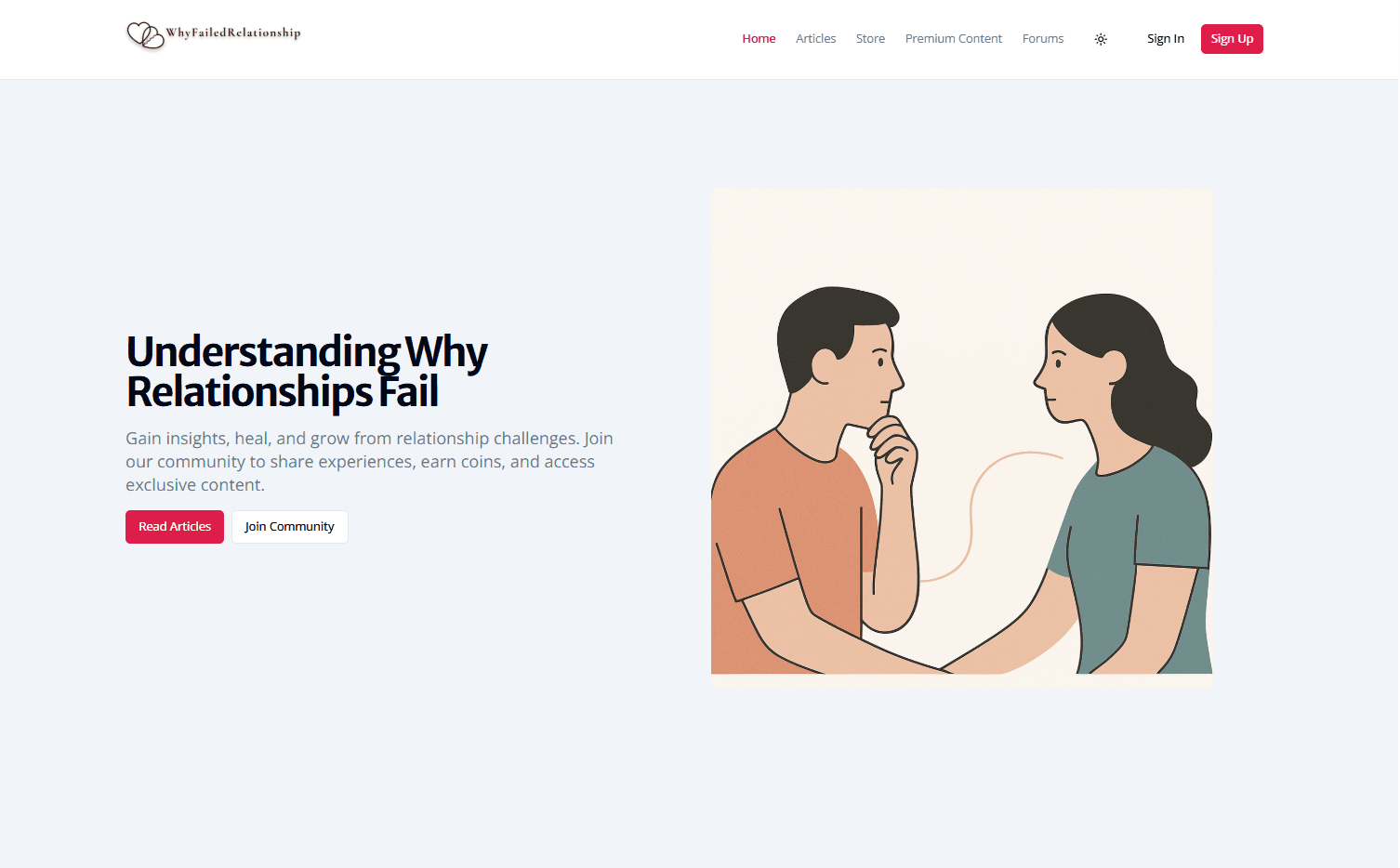
Home / Entry Experience
The homepage establishes a calm first impression and routes users into learning, reflection, and community without pressure-heavy engagement patterns.
Screen 2
Knowledge Base Navigation
The content system is grouped around real relationship problem areas so users can quickly find material relevant to their situation.
Screen 3
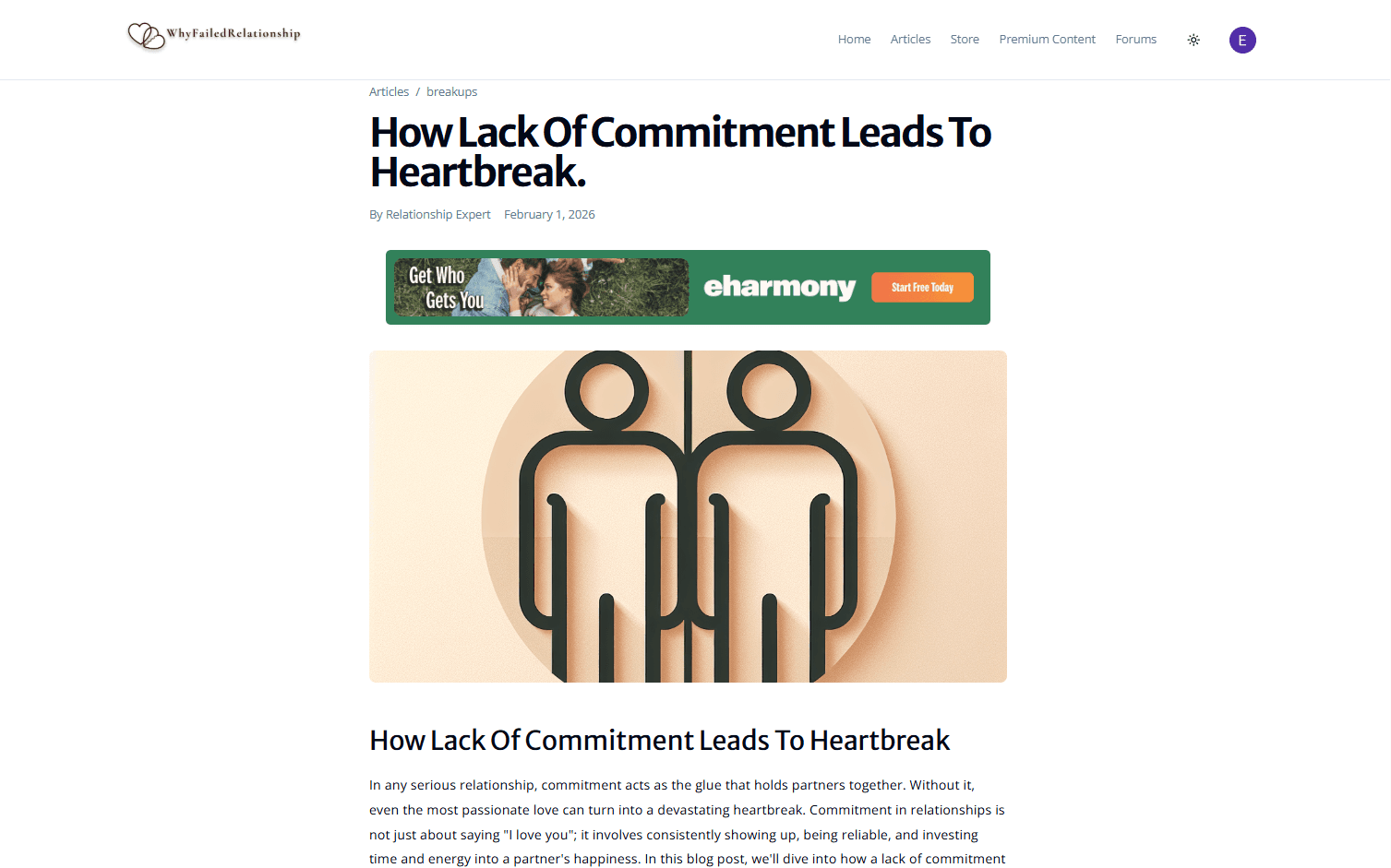
Article Reading Experience
Long-form reading uses generous spacing and minimal distractions to support deep reflection and comprehension.
Screen 4
Community Forum
Forum threads prioritize readability and emotional tone, helping users learn from similar experiences in a safer environment.
Outcome and Insight
The strongest product insight was that people often do not need more relationship advice. They need a better system for reflecting on their own experience.
This project demonstrates my ability to design for emotionally sensitive behavior, create structure from ambiguous user pain, and translate that into a working product direction.