Overview
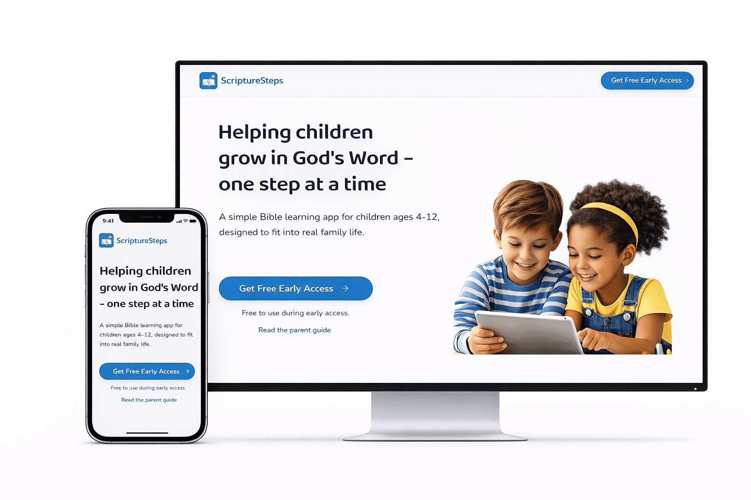
Scripture Steps is a guided scripture-learning platform for children that turns Bible engagement into a short daily routine instead of an overwhelming study session.
The product combines structured weekly lessons, age-adaptive curriculum, and multi-sensory activities so children can listen, speak, write, reflect, and pray in a way that fits real family life.
A family-based account structure keeps parent management separate from the child learning environment, allowing oversight without disrupting independence.
The Problem
Long passages and unstructured lessons overwhelm young learners.
Most digital Bible products are designed for adults, not children.
Families struggle to maintain a consistent daily learning rhythm.
Occasional scripture exposure rarely turns into a lasting habit.
Product Vision
The core product principle was simple: spiritual growth develops through consistent small steps.
Instead of asking families to sustain long study sessions, Scripture Steps focuses on short daily interactions that can be completed in minutes but repeated consistently over time.
The design goal was to transform scripture learning into a family-supported habit rather than an occasional event.
Research Insights
Children engage better with short, structured activities than long reading sessions.
Listening, speaking, and writing together improve scripture retention.
Consistency matters more than duration when building spiritual habits.
User Journey Flow
Daily Activities
This journey keeps account management and child learning clearly separated while guiding families from setup into a repeatable daily habit loop.
Learning System
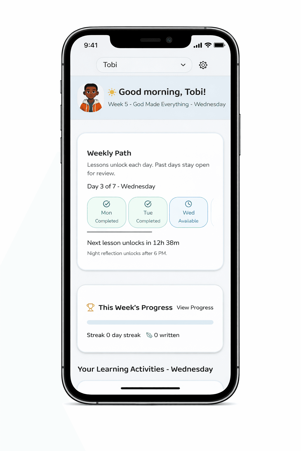
Weekly Learning Path
A seven-day structure where lessons unlock progressively, past lessons remain available for review, and future activities stay locked until the right day.
Daily Activities
Children move through books of the Bible, verse memorization, reflection, and guided prayer in sessions designed to take three to five minutes.
Writing and Reinforcement
Weekly writing exercises help children internalize the verses they learned and turn repetition into stronger memory.
Adaptive Curriculum Design
The product follows a 52-week curriculum with age-adaptive content. Younger children receive shorter verses, fewer books of the Bible, and simpler explanations. Older children receive longer verses, more books, and deeper reflection prompts.
This keeps learning developmentally appropriate while supporting long-term spiritual growth.
UI Design Breakdown
The product UI was designed around two audiences, parents and children, with each surface intentionally simplified around the job it needs to do.
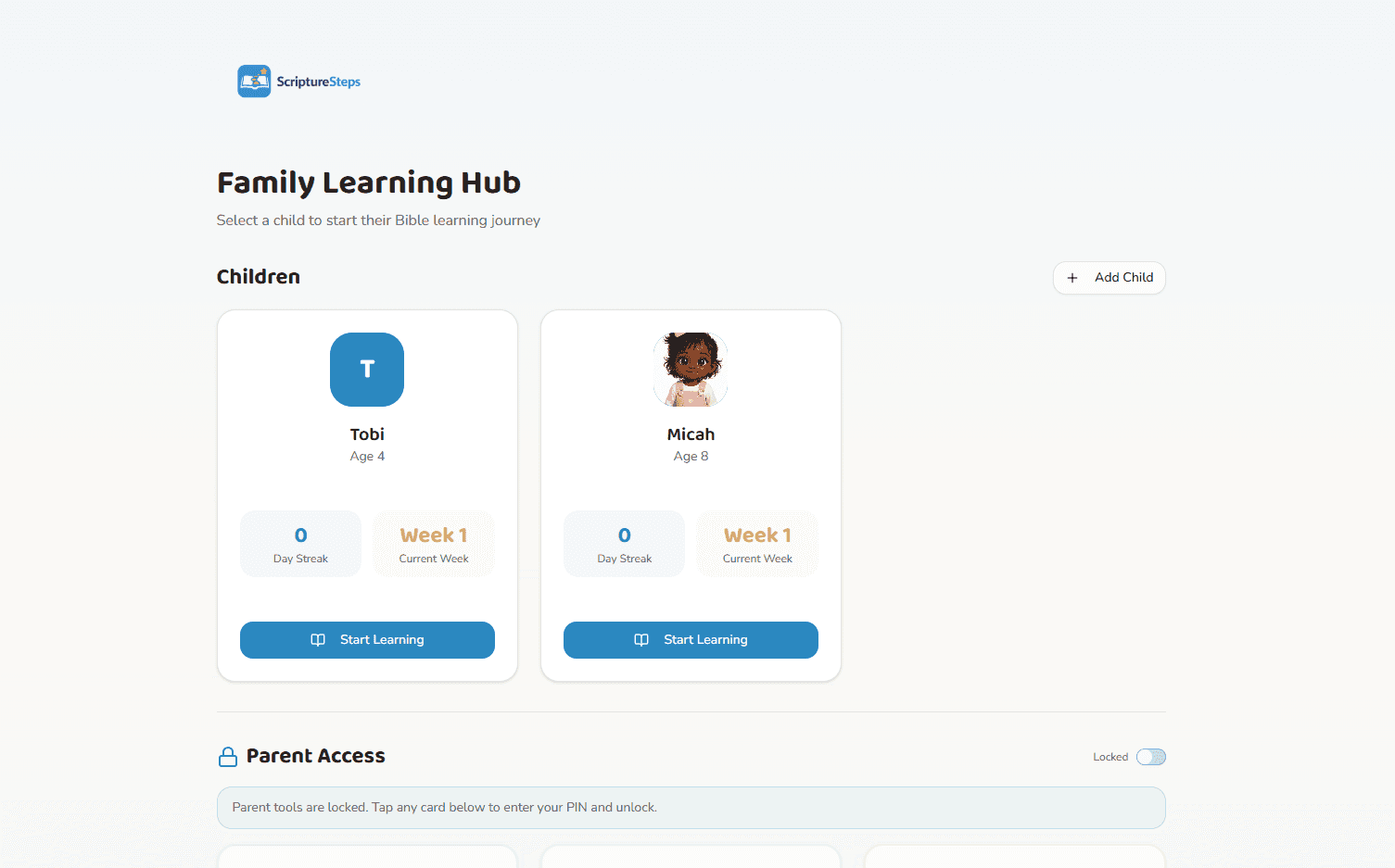
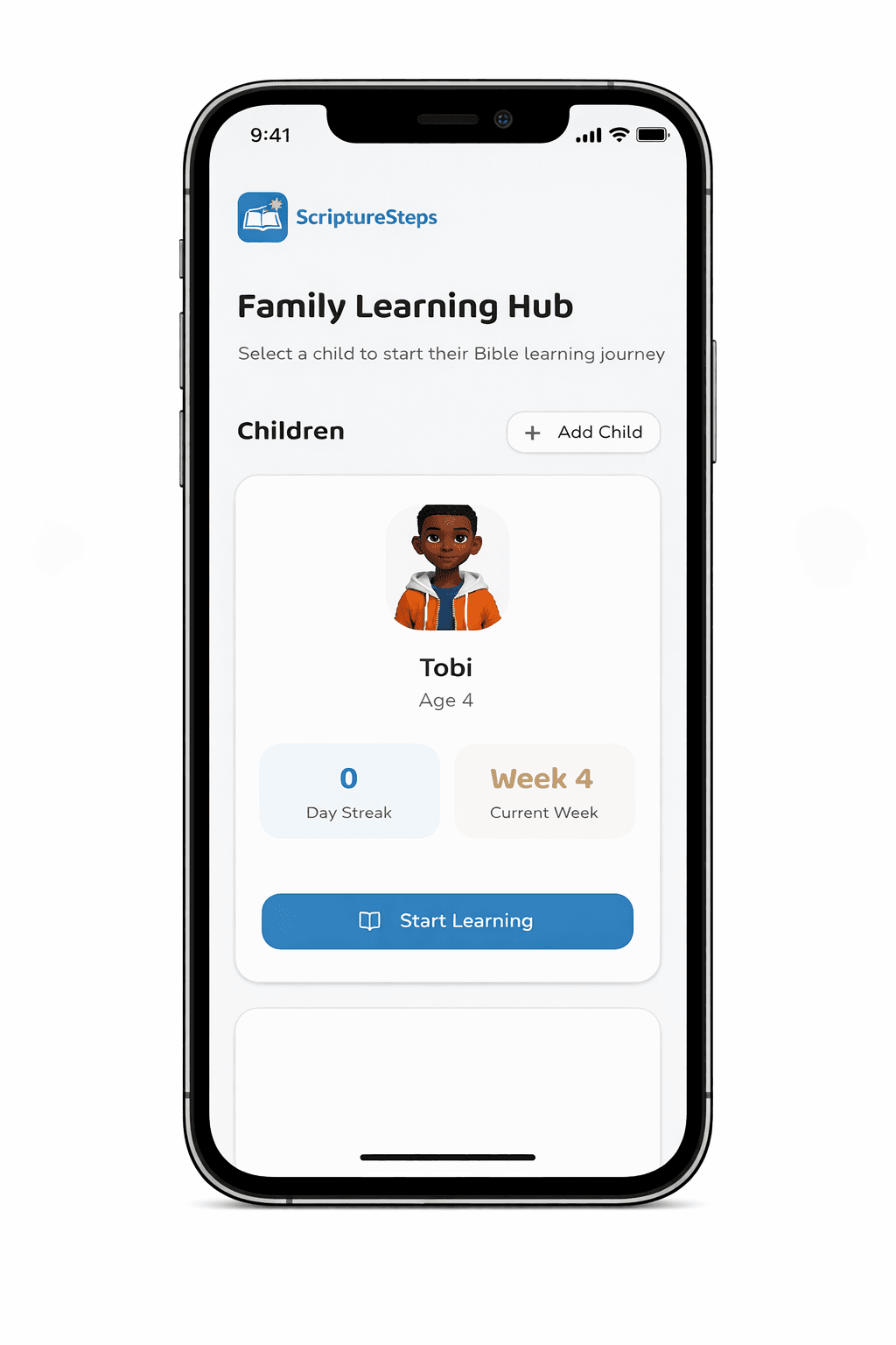
Family Learning Hub
Parent-facing dashboard for managing child profiles, viewing progress, downloading lessons, and starting learning sessions.
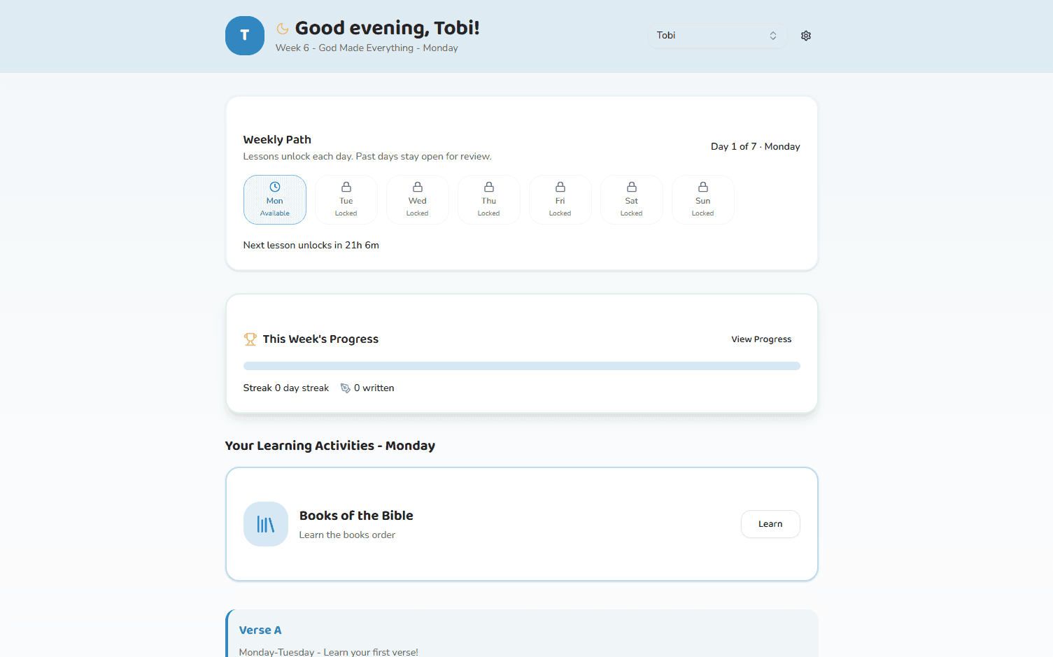
Child Learning Portal
A simplified child environment with minimal navigation, clear weekly pacing, and obvious next-step actions.
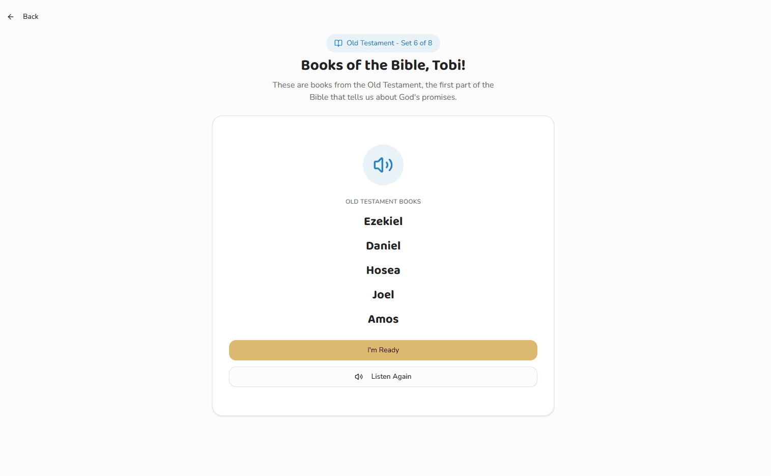
Daily Lesson Flow
Short guided activities for verse learning, books of the Bible, reflection, writing, and prayer designed for three-to-five-minute sessions.
Responsive Experience
The web app was also designed to hold up on smaller screens, keeping the same guided learning flow while simplifying spacing, hierarchy, and tap targets for mobile use.
Interaction Patterns
Profile-based navigation lets parents manage multiple children from one family hub.
Large card-based modules make the next learning step obvious for young users.
Progressive lesson unlocking supports routine instead of binge-style usage.
Minimal navigation keeps the interface calm and focused.
Design Challenges
The primary design challenge was balancing parental oversight with child independence.
Parents needed progress visibility and account control, while children needed a simple, distraction-light environment they could navigate confidently.
That tension led directly to the dual-dashboard structure, progressive lesson unlocking, and intentionally minimal navigation.
Impact and Success Metrics
Daily activity completion
Weekly curriculum completion
Learning streak consistency
Scripture retention through review
Parent satisfaction with usability and progress
Reflection
Scripture Steps shows how product design can turn scripture learning into a sustainable daily habit instead of an occasional family intention.
By combining family-guided account management, structured curriculum pacing, age-adaptive lessons, and multi-sensory interaction design, the product creates a clearer path toward consistent spiritual learning for children.
Future Improvement
A planned next step is short animated storytelling that explains the meaning behind each verse and helps children connect scripture to real-life situations.